<< Registration Sites | Open Translate >> Old Site Designs
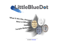
Click on a thumbnail for a larger image.
This site has gone through many changes since its inception back in 1999. I thought I'd gather together a few of the better designs, since despite their various failings, I have a soft spot for each of them.
 My first site was LittleBlueDot.net - really just a hobby site;
somewhere I could mess around with webpages, javascript and PHP and make sense of the weird
and wonderful world of the Web. During my philosophy degree, I was enrolled in co-op (yes,
believe it or not, they DO have co-op philosophy) - and I kept getting told to "learn HTML! So
many employers need you to have basic web skills!". Well, I took their advice, and quickly
developed a taste for it.
The site sure looked nice, but didn't contain much in the way of content. The splash page (shown in the thumbnail above) was certainly pretty - but very image intensive and took a long time to load. Plus it contained some of the most hideous auto-generated javascript imaginable. Ah, Adobe ImageMagick...
 Next came benjaminkeen.org. This was probably around 2001 or so. I again went with a main splash
page (shown in the thumbnails below) linking to the various sections of the site. The splash page
actually came in four styles - which would load randomly. I colour coded each design - which was
rather a nice visual effect, I think.
By this point, the site itself actually started to grow. I started compiling various javascripts,
PHP scripts and others, and releasing them here - unfortunately, the UI was dreadful; I hadn't really
given much thought to how the site should be organized, and some assumptions (like the overall content)
were simply proven inaccurate. I ended up developing a lot more scripts than
 I had initially planned, so it became pretty clear, pretty soon that a new site structure was needed.
That's when I dumped .org and moved to .com - and the site you see today.
I'm not saying my current site is fantastic, but it's a darn site better than my previous designs. The use of the tabs to group the main sections and the breadcrumb trail to the right to show the page heirarchy within the main sections makes for simple navigation, I think. I included the menu to the right (which appears on most, but not all pages), since it offers a nice overview of the site highlights. Yeah, I'm pretty happy with it. :-)


